
What is Technical Analysis?
Technical analysis is a tool that assists people in predicting where the price of assets like stocks or money will go in the future. It takes into account market data. The concept is that if a large number of individuals are buying or selling something, it indicates how much the item is worth at the time. So it tries to figure out what a reasonable pricing is for that item based on what everyone else is doing in the market.

Past Price as an Indicator of Future Performance
Many traders believe that the way prices have moved recently or in the past can assist in anticipating how they will move in the future. This is known as technical analysis.
However, it is not only used by technical traders. Fundamental analysis is used by some traders to determine whether or not to invest in a market. When they make the decision to invest, they employ technical analysis to determine the optimal moments to buy at low prices with minimal risk.

Charting on Different Time Frames
Price charts are used by technical traders to forecast where prices will move. They consider two factors: the length of time they’re looking at (such as minutes, hours, or months) and the instruments they employ to make forecasts. They examine temporal durations ranging from one minute to a year. Some examples are:
- 5-minute chart
- 15-minute chart
- Hourly chart
- 4-hour chart
- Daily chart
The time span that a trader chooses to analyze is usually influenced by that trader’s unique trading style. Intra-day traders, or those who open and close trades within a single trading day, like to analyze price action using shorter time frame charts, such as 5-minute or 15-minute charts. Long-term traders who maintain market positions overnight or for extended periods of time are more likely to use hourly, 4-hour, daily, or even weekly charts to analyze markets.
Price changes that occur within a 15-minute time frame can be fairly substantial for an intraday trader looking for a chance to profit from price fluctuations that occur during a single trading day. The same price change, however, may not be seen on a daily or weekly chart.
This is easily demonstrated by looking at the same price movement on several time frame charts. The daily chart for silver below shows it trading in the same band, about $16 to $18.50, that it has been in for several months. A long-term silver investor may be tempted to buy silver since the price is close to the bottom of that range.
However, the same price action on an hourly chart (below) reveals a consistent fall that has increased slightly in the last few hours. A silver investor who is solely interested in making intraday trades would probably avoid purchasing the precious metal based on the price activity on the hourly chart.

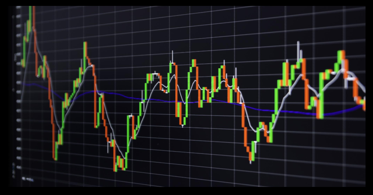
Candlesticks
Candlestick charting is the most common way to display price movement on a chart. For any time frame, a candlestick is generated by the price activity within a single time period. Each candlestick on an hourly chart represents the price action for one hour, whereas each candlestick on a 4-hour chart represents the price action for four hours.
Candlesticks are “drawn” / made in the following manner: The highest point of a candlestick represents the highest price security traded during that time period, while the lowest point of a candlestick represents the lowest price during that time period. The “body” of a candlestick (the corresponding red or blue “blocks” or thicker regions of each candlestick as illustrated in the charts above) signifies the opening and closure of the candlestick. If a blue candlestick body forms, it means that the closing price (top of the candlestick body) is higher than the opening price; if a red candlestick body forms, it means that the opening price is higher than the closing price.
Colors for candlesticks are arbitrary choices. Some traders employ white and black candlestick bodies (the basic and most often used color format); other traders may use green and red, or blue and yellow. Whatever colors are used, they make it simple to see if the price closed higher or lower at the conclusion of a given time period. Technical analysis using a candlestick chart is frequently easier than technical analysis with a basic bar chart because the analyst obtains more visual hints and patterns.

Candlestick Patterns – Dojis
Candlestick patterns, which can be created by a single candlestick or by a series of two or three candlesticks, are among the most commonly used technical indicators for detecting future market reversals or trend changes.
Doji candlesticks, for example, reflect market hesitation and may foreshadow an upcoming trend change or market reversal. A doji candlestick is distinguished by the fact that its opening and closing prices are identical, resulting in a flat candlestick body. The longer the upper and/or lower “shadows” or “tails” on a doji candlestick – the component of the candlestick that represents the time period’s low-to-high range – the stronger the indication of market hesitation and probable reversal.
As illustrated in the figure below, there are various types of doji candlesticks, each with its own distinguishing name.
The long-legged doji is a common doji in which the price stretches roughly equally in either direction, opening and shutting in the middle of the price range during the time period. The appearance of the candlestick provides a strong visual indication of market hesitation. When a doji like this happens after a market has been in an extended uptrend or downturn, it is generally viewed as indicating a likely market reversal, or a trend change in the opposite direction.
When the dragonfly doji appears after a long decline, it indicates an impending upward reversal. The logical meaning of the dragonfly doji is explained by examining the price activity indicated by it. The dragonfly depicts sellers driving the price significantly lower (the long lower tail), but the price returns to close at its greatest point at the conclusion of the term. The candlestick essentially represents a rejection of the extended downward push.
The name of the gravestone dojo obviously implies that it represents bad news for buyers. The gravestone doji, the inverse of the dragonfly formation, signals a severe rejection of an attempt to push market prices higher, implying a likely reverse reversal.
The unusual four-price doji, in which the market opens, shuts, and buys and sells at the same price throughout the time period, is the embodiment of hesitation, a market that displays no propensity to go anyplace in particular.
There are dozens of different candlestick forms to choose from, as well as various pattern variations. Thomas Bulkowski’s pattern site is probably the most comprehensive resource for detecting and utilizing candlestick patterns, as it thoroughly describes each candlestick pattern and even includes information on how frequently each pattern has historically provided a good trading signal. It’s useful to know what a candlestick pattern means, but it’s even more useful to know if that indicator has been confirmed to be correct 80% of the time.

Technical Indicators – Moving Averages
In addition to analyzing candlestick formations, technical traders can use a seemingly limitless number of technical indicators to help them make trading decisions. Moving averages are most likely the most commonly utilized technical indicator. Moving averages are used in many trading methods. “Buy as long as price remains above the 50-period exponential moving average (EMA); sell as long as price remains below the 50 EMA,” can be a simple moving average trading strategy.
Moving average crossings are another popular technical indication. Buying when the 10-period moving average crosses over the 50-period moving average could be a crossover trading technique. The greater the value of a moving average, the more significant price movement in regard to it is deemed. A price crossing above or below a 100- or 200-period moving average, for example, is normally seen as far more significant than a price crossing above or below a 5-period moving average.
Technical Indicators – Pivots and Fibonacci Numbers
Many traders employ daily pivot point indicators, which typically identify many support and resistance levels in addition to the pivot point, to identify price levels for entering or exiting trades. Pivot point levels are frequently used to indicate strong support or resistance levels, as well as levels where trading is limited inside a range. Many traders view trading through the daily pivot and all accompanying support and resistance levels as “breakout” trading, which will change market prices significantly higher or lower in the direction of the breakout.
The previous trading day’s high, low, opening, and closing prices are used to construct daily pivot points and their related support and resistance levels. I’d show you the computation, but there’s really no need because pivot point levels are widely publicized each trading day, and there are pivot point indicators you can simply load on a chart that do the calculations and expose pivot levels for you. Most pivot point indicators display the daily pivot point as well as three price support levels below it and three price resistance levels above it.

Fibonacci Retracements
Another common technical analysis method is Fibonacci levels. Fibonacci was a 12th-century mathematician who devised a set of ratios that are widely used by technical traders. Fibonacci ratios, or levels, are frequently utilized to identify trading opportunities as well as trade entry and profit goals that emerge throughout long-term trends.
The Fibonacci numbers are 0.24, 0.38, 0.62, and 0.76. These are frequently stated as percentages – 23%, 38%, and so on. It is worth noting that Fibonacci ratios complement one another: 24% is the opposite, or remainder, of 76%, and 38% is the opposite, or remainder, of 62%.
As with pivot point levels, there are various free technical indicators that will compute and display Fibonacci levels on a chart.
The most commonly used Fibonacci indicator is retracements. After security has been in a long-term uptrend or downtrend, there is sometimes a corrective retracement in the opposite direction before the price restarts the overall long-term trend. During a retracement, Fibonacci retracements are utilized to discover good, low-risk trading entry locations.
Assume that the price of stock “A” has steadily risen from $10 to $40. The stock price then begins to decline slightly. During a price pullback, many investors will hunt for a favorable entry point to buy shares.
According to Fibonacci numbers, price retracements are anticipated to be equal to 24%, 38%, 62%, or 76% of the upward advance from $10 to $40. Investors are looking for signs that the market has found support and that prices will begin to rise again. For example, if you were looking to buy the stock after a 38% price retracement, you could place an order to buy around the $31 price level. (The change from $10 to $40 equals $30; 38% of $30 equals $9; $40 – $9 = $31)
Fibonacci Extensions
Continuing with the previous example, suppose you bought the stock at $31 and are attempting to set a profit target at which to sell it. You can use Fibonacci extensions to determine how much higher the price can go when the overall uptrend restarts. The Fibonacci extension levels are set at values that correspond to 126%, 138%, 162%, and 176% of the original uptrend move, as measured from the retracement’s low. So, if a 38% retracement of the original move from $10 to $40 turns out to be the retracement low, then add 126% of the original $30 advance upward to discover the first Fibonacci extension level and probable “take profit” objective. The calculations go as follows:
A Fibonacci extension level of 126% = $31 + ($30 x 1.26) = $68 – a target price of $68.
Again, you never have to perform any of these calculations. Simply insert a Fibonacci indicator into your charting software, and it will display all of the Fibonacci levels.
Even if you don’t use pivot and Fibonacci levels as indicators in your trading approach, they are worth following. Because so many traders base their buying and selling moves on pivot and Fibonacci levels, there is likely to be extensive trading activity around those price points, which may help you better predict anticipated future price movements.

Technical Indicators – Momentum Indicators
Moving averages and most other technical indicators are primarily concerned with predicting market direction, either up or down.
However, there is another class of technical indicators whose primary aim is to determine market strength rather than market direction. Popular indicators include the Stochastic Oscillator, Relative Strength Index (RSI), Moving Average Convergence-Divergence (MACD), and Average Directional Movement Index (ADX).
Momentum indicators, which measure the strength of price movement, assist investors in determining whether current market movement represents relatively small, range-bound trading or a genuine, important trend. Because momentum indicators evaluate the strength of a trend, they can provide early warning signs that a trend is about to terminate. For example, if a security has been trading in a strong, consistent uptrend for several months and one or more momentum indicators indicate that the trend is losing strength, it may be time to consider taking profits.
The USD/SGD 4-hour chart below demonstrates the importance of a momentum indicator. The MACD indicator is displayed in a window distinct from the main chart window. The steep increase in the MACD beginning around June 14th suggests that the corresponding price increase is a strong, trending advance rather than a brief correction. When the price begins to retrace lower somewhat on the 16th, the MACD indicates weaker price action, indicating that the downward price trend lacks momentum. Soon after, a robust upward trend resumes. In this case, the MACD would have helped reassure a market buyer that (A) the price increase to the upside was strong and (B) the uptrend was likely to resume after the price sank somewhat on the 16th.

Technical Analysis – Conclusion
Remember that no technical indication is flawless. None of them consistently provides 100% accurate indications.
The most astute traders are constantly on the lookout for warning signs that signals from their preferred indicators may be deceiving. Technical analysis, when done correctly, can significantly increase your trading profitability. However, spending more time and effort thinking about how to handle things if the market swings against you, rather than fantasizing about how you’re going to spend your millions, may do more to improve your trading fortunes.